HCP product
site redesign

THE PROBLEM
This HCP brand was surviving on a legacy site. It had several patches to make it work, but the time came to make a radical change. The client agreed to have user research conducted on their site, and the findings were quite enlightening.
RESEARCH & DISCOVERY
We conducted rigorous research with a sample group of physicians in partnership with our research department. The sample group reflected the criteria of the research sessions; some physicians did or did not prescribe the drug in the past. Some others were motivated to check information online. For the first and second line of treatment, these physicians would research data and combination treatments for cancers related to the liver and other organs online.
Some of the findings were:
Physicians were not particularly impressed or liked "the perfect patient" art imagery. If the art helped explain how the drug may help them with treatment, they discarded it as a waste of time and space.
Dark-looking websites were a turn-off to them. The reason is that the content did not speak to them in the dark.
They felt that the CTAs needed to be more precise and had questions related to the UX.
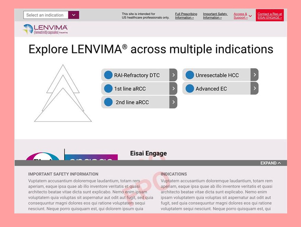
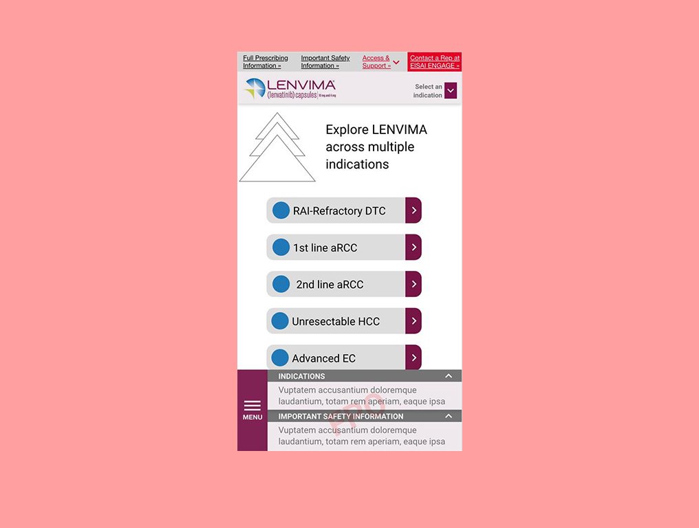
The physicians prefer other sites where the indications are upfront and easy to find. Helping their decision-making by having all current indications upfront would be necessary.
They were interested primarily in efficacy, side effects, and dosing management. An effective way to quickly navigate should be created.
Finding the services to access the medication was a secondary need but necessary as an objective for them. Making it easy to find or centralizing the information would allow their staff to find it.
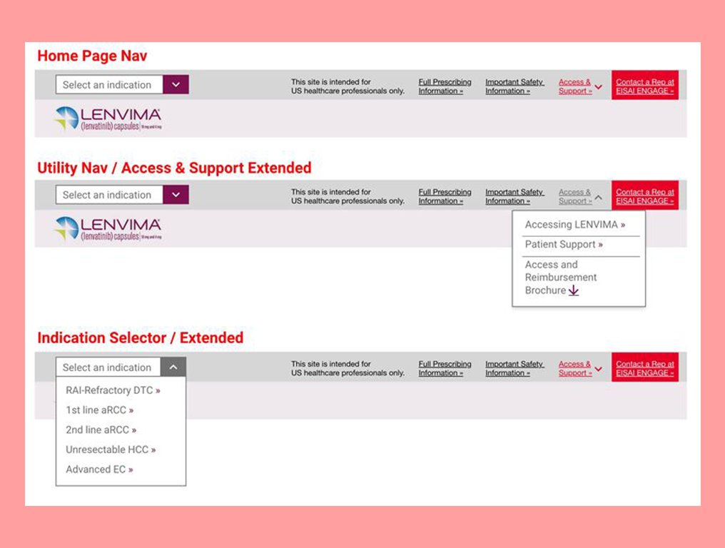
The navigation of the site needed to be adequate for them. It needed to be more apparent and quickly identify where they were.
With all these findings in place, we started to work on a better experience.
MY ROLE
As the lead UX for product, my first task was to decode all the findings from the research. Several conversations with my team pointed us to immediate results like the navigation needed a complete redesign to accommodate the necessary content repositioning. In addition, the way the user accesses forms and other essential documentation must be centralized. Also, the site's architecture would have to be designed with expansion in mind, meaning to be ready to accommodate more than six indications in years to come.
WORKING DIRECTION
After the customer experience team provided their direction, I started thinking about how to solve this website's complex UX issues. The first step was to find a suitable navigation system for the site, especially on mobile.
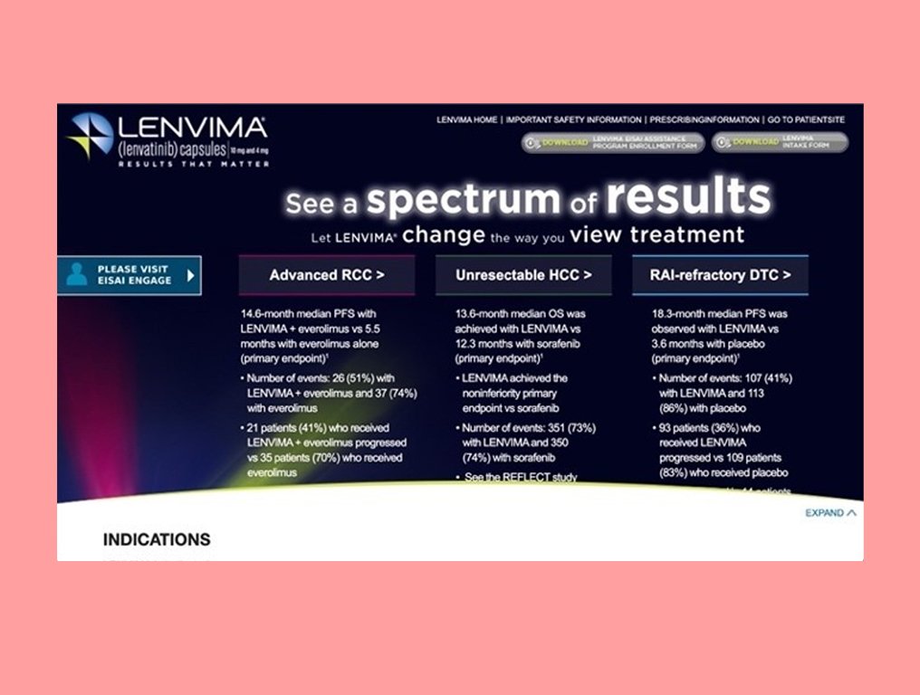
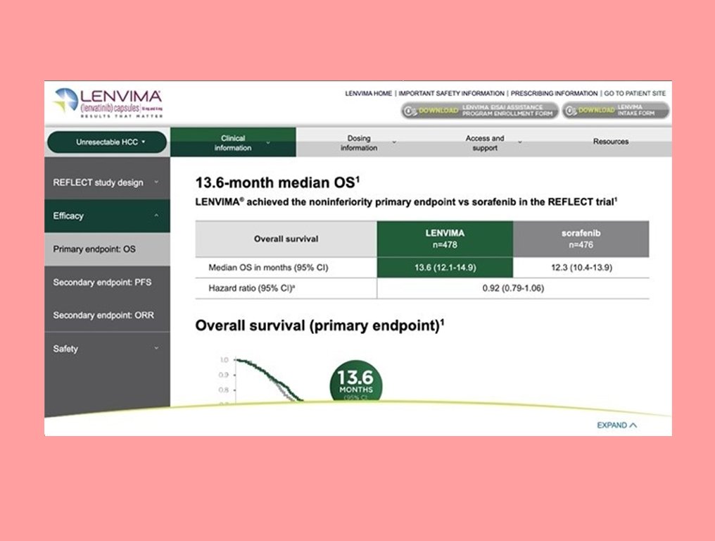
We rethought how information was organized and displayed within the site. A modular approach was suitable; components based on our internal design system would integrate the site and provide plenty of space to communicate data without compromising their integrity.
After some research and collaboration with the innovation team, I created a simple solution for the navigation. We would use the left-thumb area for global nav on mobile. Making it easier for the user to navigate with one hand and putting all the answers they may seek on this site closer to their hands.
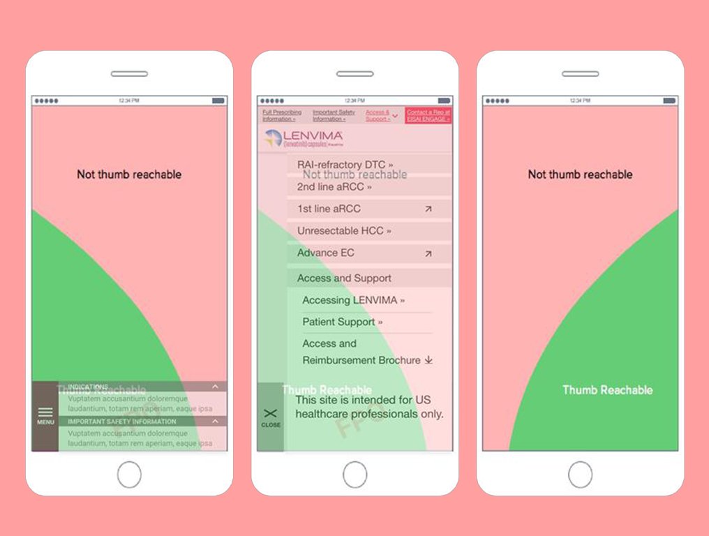
For the desktop, a different approach was created. A riel navigation system was designed. This was to provide suitable space for a global nav and plenty of room for the sub-navigation. Future thinking is what we always apply to all digital solutions. Otherwise, these solutions would not grow with time.
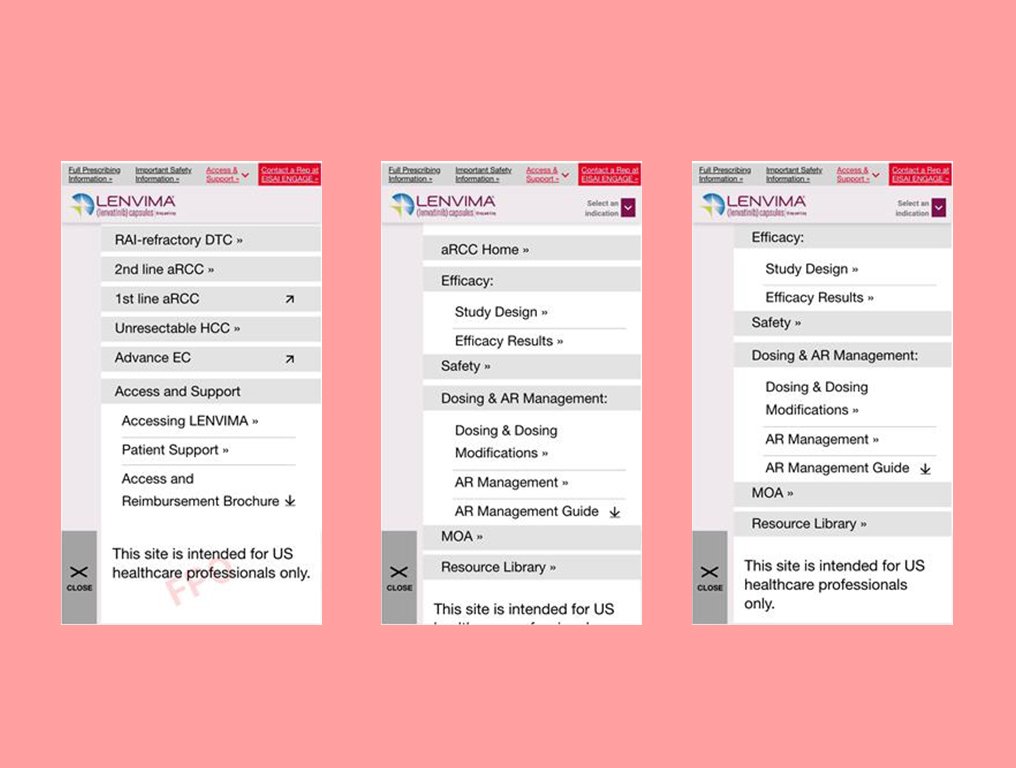
THE UX RESULTS
After the innovation team approved the changes, the lo-fi wires delivered an effortless way to navigate all sections of this complex data-driven site. These changes would allow the client to showcase valuable information on the website.
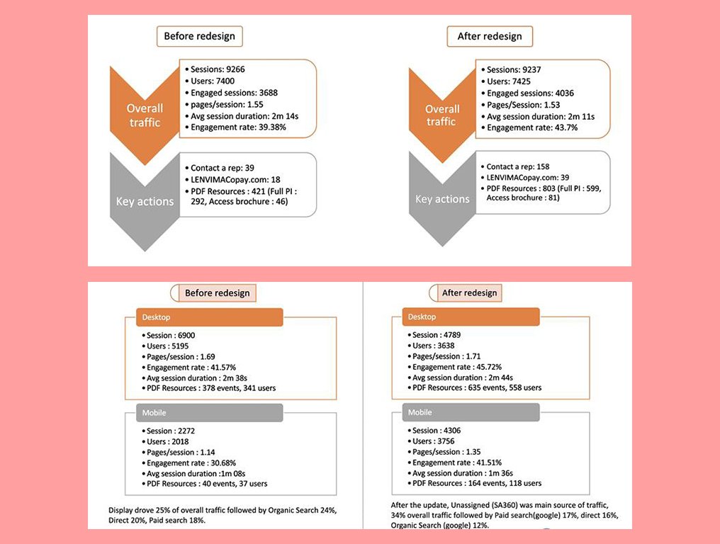
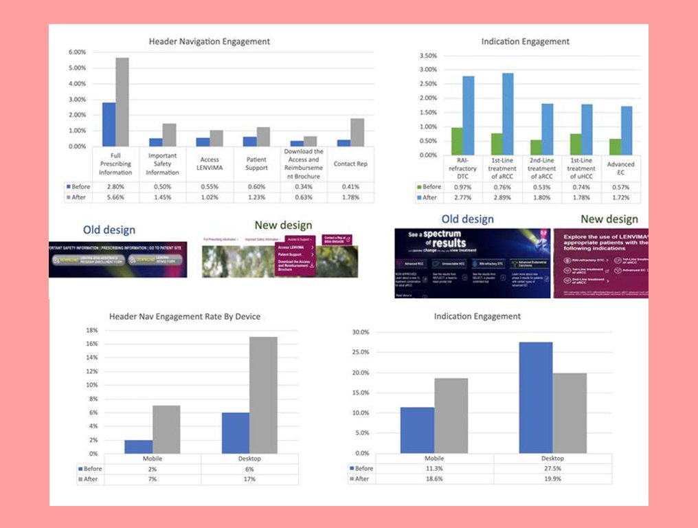
THE FIRST QUARTER RESULT
Our internal analytics team created a report based on the first quarter since this site launched, and the results are as expected. An increase in mobile traffic, this been the most used device to access the previous website. Among the data, we find the results for the overview of high-level traffic volume and engagement rates, key actions (Monthly average), by Mobile VS Desktop (Monthly), engagement rate with main nav before and after, engagement with main nav before and after by Mobile VS Desktop.