
System
of Courses
(SOC) Platform
Context
Pearson was operating a learning platform used daily by children and teachers in public schools. The product ecosystem had grown fragmented over time, with multiple teams working asynchronously across different platforms, primarily iOS and Windows tablets.
The result was a system that struggled to stay current, both technically and experientially, in environments where time, bandwidth, and reliability were critical, especially inside classrooms.
This project represented an opportunity to reset the platform direction, simplify delivery, and improve day-to-day classroom usability at scale.
The Process
01 / Problem Framing
The existing system faced several compounding issues:
Platform fragmentation across devices
Slow and unreliable content downloads
Poor coordination between internal teams
Network saturation in school environments
Classroom delays caused by technical friction
In parallel, Pearson was exploring a shift to Chromebooks, driven by significantly lower hardware replacement costs for schools.
The core challenge was not only redesigning an app, but restructuring how educational content was delivered, accessed, and managed.
02 / Approach
The project required simplifying both the user experience and the underlying system logic.
Key focus areas included:
Reducing classroom friction
Designing for inconsistent connectivity
Supporting teachers’ real workflows
Ensuring the system scaled across devices and users
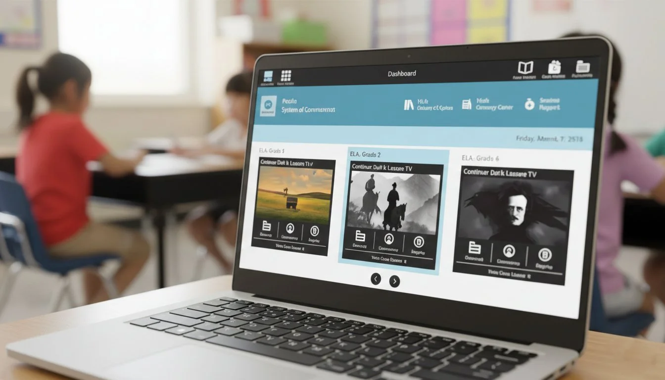
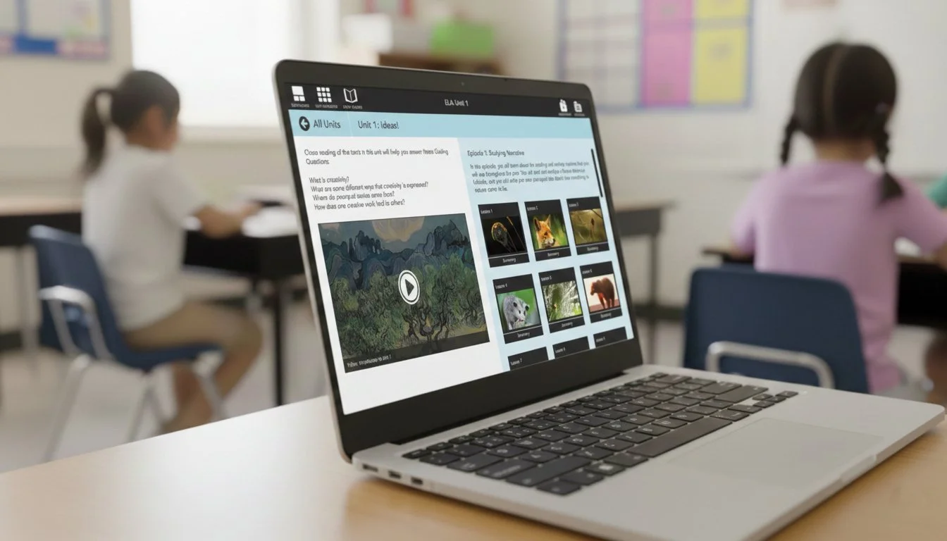
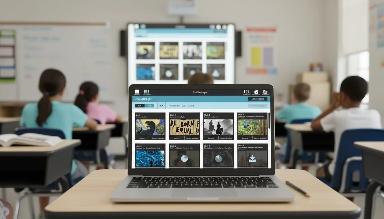
I designed new user paths that emphasized on-demand access, clarity, and control, rather than bulk content delivery.
To align teams and stakeholders, I produced interactive demos that communicated not only what the product would do, but how it would behave in real classroom conditions.
03 / Research
We conducted in-person research sessions in Ohio with three distinct user groups:
Users comfortable with computers
Users unfamiliar with computers
Existing users of the current app
Participants included children, parents, and teachers.
The testing validated both usability and system logic. The proposed direction achieved an 80% approval rate, providing strong evidence to move forward and align internal stakeholders around the new approach.
04 / Key Idea
To address long download times and network congestion, I proposed a metadata-first content model. Instead of downloading full course packages upfront:
Users initially downloaded only lightweight metadata
This allowed them to preview content before committing
Full lessons were downloaded only when needed
Completed work could be uploaded to the cloud and removed locally
This model:
Reduced network strain
Improved classroom efficiency
Gave teachers and students more control
Aligned with real-world school constraints
05 / Outcomes
The redesigned system delivered measurable improvements:
Faster and more predictable content access
Reduced classroom delays
Lower network impact in shared environments
Improved confidence and satisfaction among teachers
A clearer, more intuitive experience for students
Teachers in particular valued the ability to download, use, upload, and clear content quickly, enabling smoother classroom sessions and better time management.
Why This Matters
As UX Lead, I was responsible for:
Defining a new product direction
Designing updated user flows and interaction models
Rethinking content delivery behavior
Translating research insights into a cohesive system
Creating demos to align internal teams and stakeholders
I operated across strategy, interaction design, and validation.

This project demonstrates my ability to:
Simplify complex platform problems into clear systems
Design for constrained, real-world environments
Lead UX direction across organizational and technical boundaries
Balance user needs, infrastructure limits, and business realities
It is a strong example of systems-driven UX leadership, where experience design directly improves operational efficiency and educational outcomes.