Scalable
Design
System
Context
A combination drug from two brands proved effective for cancer patients over 50 years old. The brands needed a dedicated HCP-facing website to support awareness and education.
The site required its own design system, separate from the patient-facing experience, with its own look and feel. At launch, the platform supported two medical indications, with up to 12 additional indications still under review. A key requirement was architecting a global navigation flexible enough to accommodate all of them as they gained approval.

The Process
01 / Problem Framing
As a net-new platform, the site needed a unified design system created from scratch to guide component reuse, naming conventions, responsive layout behavior, and scalable navigation.
Without a unified system in place:
Navigation risked becoming overpopulated and confusing as indications scaled
Each new indication would require ad-hoc interaction patterns
Visual inconsistency would slow delivery velocity
Accessibility compliance would be difficult to maintain from the start
Building a structured, scalable design system was essential to launch the platform effectively and support its long-term growth.
02 / Approach
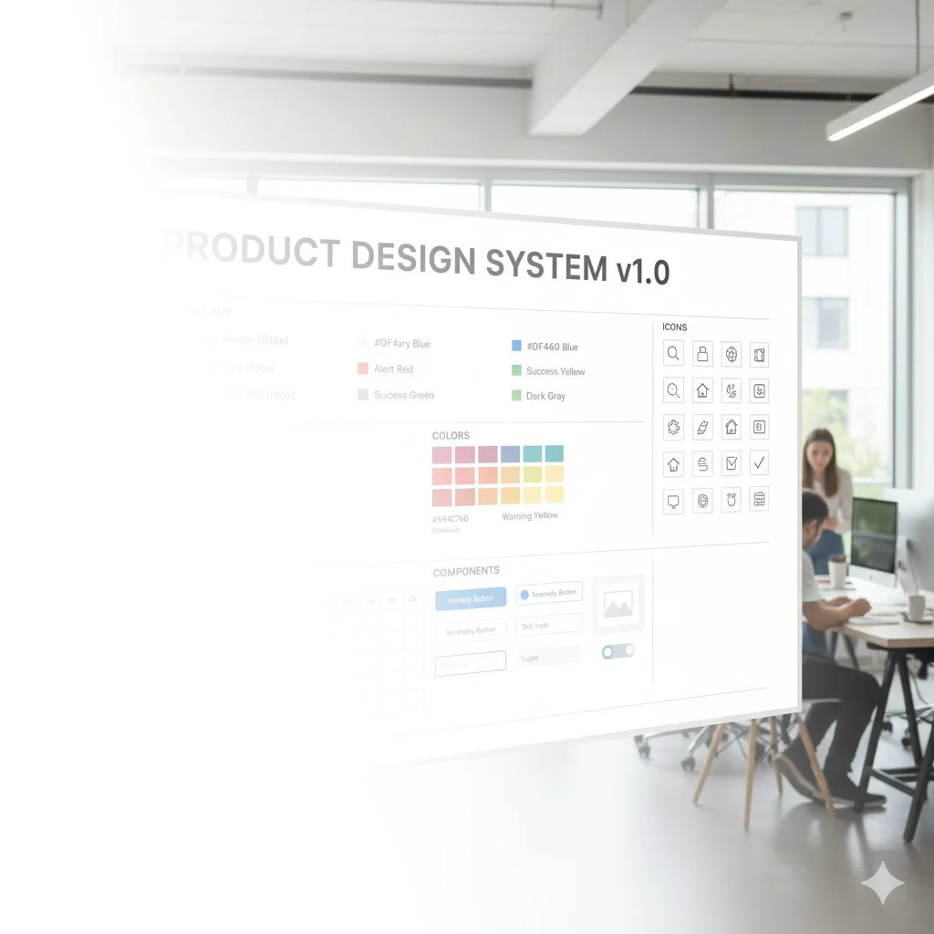
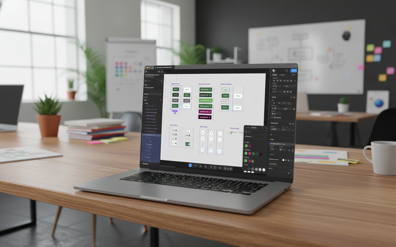
Working alongside two UI designers, I defined a token-based foundation and a scalable component architecture in Figma.
The approach emphasized:
Token definition for color, spacing, shape, and typography
Clear component boundaries and naming conventions
A navigation architecture that could support many primary categories
Accessibility (WCAG AA) compliance is built into the foundation
Documentation and governance to support long-term adoption
This shifted the team's thinking from page-by-page design to systematic design.
03 / Research
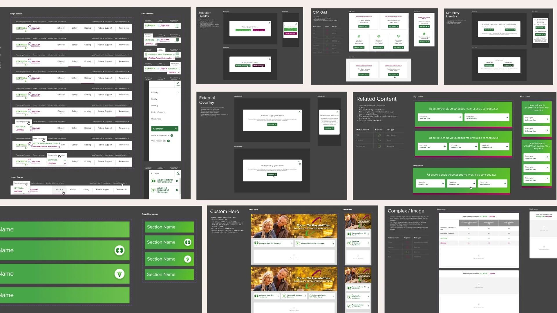
Usability studies and stakeholder workshops informed the navigation design. I prototyped several iterations of the mobile navigation and validated them against common tasks and hierarchy expectations.
Client feedback and research outcomes guided iterative refinements to ensure clarity, discoverability, and mobile friendliness.
04 / Key Idea
Rather than treating components as isolated UI artifacts, I built the system as an extensible architecture. Key system principles included:
Semantic tokens for consistent design properties
Component variants for responsive behavior and states
Modular navigation elements to support future indication growth
Governance practices to manage updates and team contributions
I created documentation and led onboarding sessions to help designers use the system effectively and maintain consistency.
05 / Outcomes
The system delivered:
A global navigation structure architected for up to 12 indications, launched with two, and ready to scale as new indications receive approval
A published and governed Figma library with foundations, components, and templates
WCAG AA-compliant color and contrast decisions
Faster design-to-development handoff through clear naming, tokens, and variants
Alignment across design, content, and engineering teams
By building a cohesive system from day one, the team launched with velocity and established a foundation ready for future expansions.

This project demonstrates my ability to:
Architect token-driven design foundations
Lead scalable navigation strategy
Establish Figma governance and published libraries
Define component boundaries for reuse and extensibility
Build systems that balance usability, accessibility, and growth
It reflects experience operating at the intersection of product strategy, systems design, and enterprise delivery.